Informa Webinars
Platform for live online events

Overview
Context
Informa is a leading international exhibitions organiser. They run large-scale events across healthcare, finance, and technology, bringing together thousands of people. To reach users outside of the busy event cycle, we built Webinars, a platform for live online talks and presentations. The platform supports two perspectives: those following the sessions and those guiding them.
Challenge
Live online sessions involve multiple things happening at once. People following the content need clear cues, while those guiding the session manage timing, transitions, and audience interaction. The challenge was to design an experience that gave both perspectives a sense of control, reduced uncertainty, and made the flow of the session understandable and manageable.
Research
We spent time observing sessions, speaking with participants, and reviewing other platforms. We saw that users were more enthusiastic to engage when information and tools appeared in context, rather than all at once. Those managing sessions worked best when controls were organised around specific tasks, and seeing what was coming next kept the flow consistent. These observations guided our design, creating a platform that felt clear, supportive, and easy to follow.
Logging in
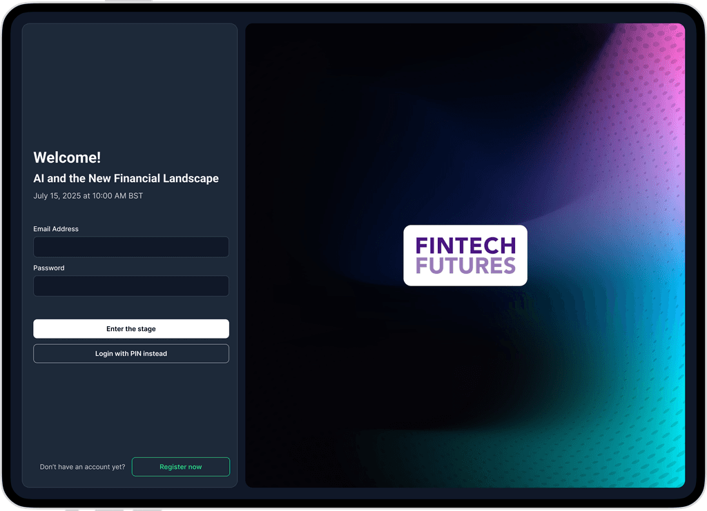
Entering sessions quickly and confidently
When attendees join a session, they arrive directly on the live stage with the session title and speaker details clearly displayed. By situating the user immediately in the context of the session, we reduce hesitation and allow them to focus on participation. Observing attendees in testing sessions, we found that those who could see the stage and session information right away began engaging with polls and chat more quickly. After implementation, attendees reported entering sessions with less uncertainty, and interactions with live features increased noticeably.
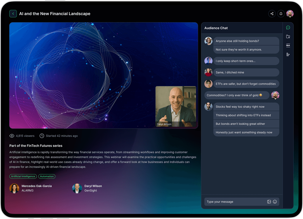
Viewing and engaging


Accessing interaction tools efficiently
During live sessions, attendees need to participate without losing track of the main content. We grouped polls, chat, and Q&A in a single side panel with clear labels and icons, keeping them visible alongside the stage. This design decision was informed by our research, which showed that engagement drops when tools are hidden behind menus or tabs. By keeping the tools accessible and predictable, participants felt more comfortable contributing throughout the session. Metrics indicated higher poll response rates and more submitted questions, and users reported that interacting felt intuitive rather than disruptive.
Managing sessions


Overseeing live events with clarity
Producers are responsible for balancing multiple elements in real time: slides, audience questions, polls, and timing. We organised the interface into modular sections that separated content, moderation, and controls. Each module clearly indicated what was active and what was upcoming, which reduced cognitive load and helped producers prioritise tasks effectively. Observations and feedback showed that this approach allowed producers to manage multi-presenter sessions more smoothly, respond to audience questions efficiently, and feel more confident throughout the event.
Presenting slides


Supporting focused slide delivery
Presenters need to navigate slides while speaking without disrupting their flow. To support this, we added a thumbnail overview displaying current and upcoming slides. This visual roadmap allowed presenters to anticipate transitions and adjust timing without leaving the stage view. Feedback from presenters indicated that this increased their confidence, resulting in steadier pacing and smoother transitions. Audiences benefited from more consistent presentations, particularly in sessions with multiple speakers, and presenters felt more prepared to manage their content confidently.
Impact and reflections
Building confidence and clarity in live events
Rolling out the platform across Informa helped teams run live events with greater clarity and confidence. Structured, predictable controls allowed producers to focus on content and delivery, while attendees engaged more consistently in polls and Q&A. Looking back, adding rehearsal support and pre-live checklists could further ease preparation, helping producers feel fully ready and building confidence from setup through live sessions.